Founded in 1991, BookMyShow is India's largest movie and event ticketing company. With a presence in over 650 Indian cities and international presence in Asia, it works along with partners across the industry to provide unmatched entertainment experiences to millions of customers.
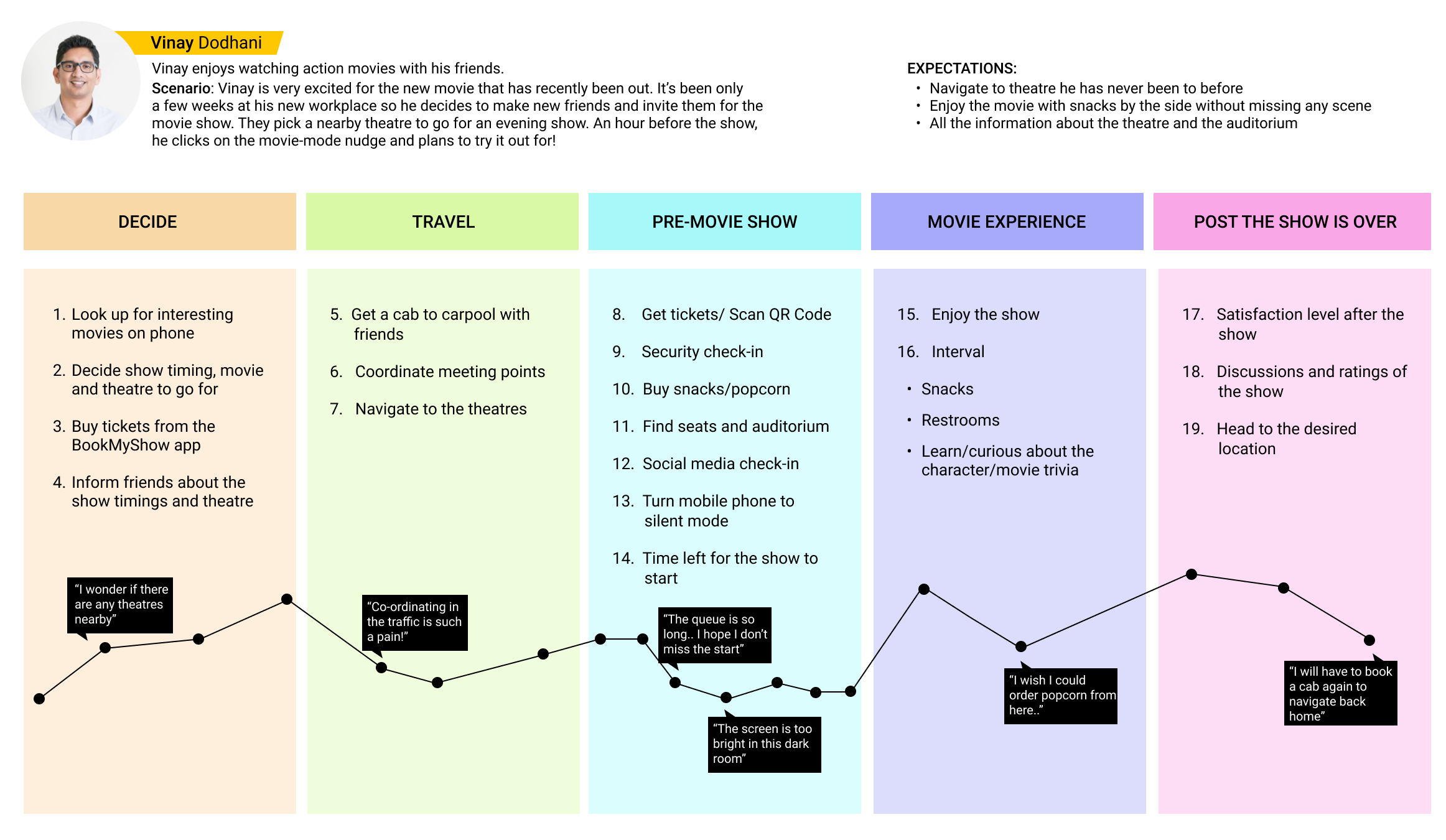
Booking movie show tickets is a very familar space for exploring design experience. However, the experience terminates at that stage. To orchestrate different parts like how to reach the theatres, ordering snacks and soda, etc, it would require users to reach out to a third party app which results in cognitive load.
Integrate multiple post-booking activities into a real-time app feature allowing user to find key information with ease.
My task was to design an extended feature to the already existing ticket booking experience for BookMyShow app users to enhance their post-booking experience. Being responsible for overall design of this feature, I closely worked with illustrators and front-end engineers to reach the desired goal.
The brand established color palette and fonts were followed throughout, to keep the consistency. The goal was to build a feature that is playful but at the same time it should help users reach the theatre location and eventually to their seats, in a seamless way.
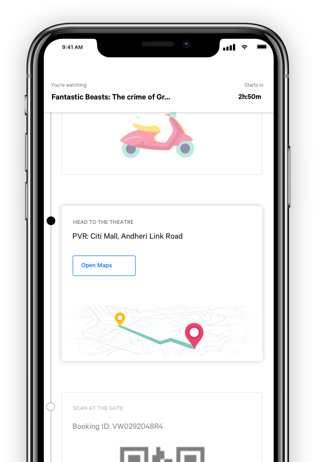
Many theatres in India do not accept QR code (M-Ticket). Physical tickets are made available by showing the booking ID available in the feature. Moreover, digging emails or opening the link sent in messages to find the QR code can be daunting. The feature also makes it easy by displaying QR card directly on the BookMyShow app.
The top band shows the movie you are about to watch and X minutes left to start the show. This band settles and stays persistent while you are scrolling through other cards.
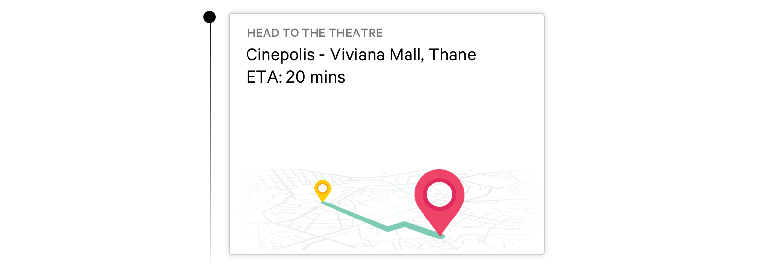
If you are going to a particular theatre for the first time, worry not! You can book a cab or directly launch google maps along with an ETA to reach the venue.
The feature displays an active card adverstising the pre-booked meal through the BookMyShow app. It also has an option to explore menu and order through movie mode feature, allow users to skip the long queues.
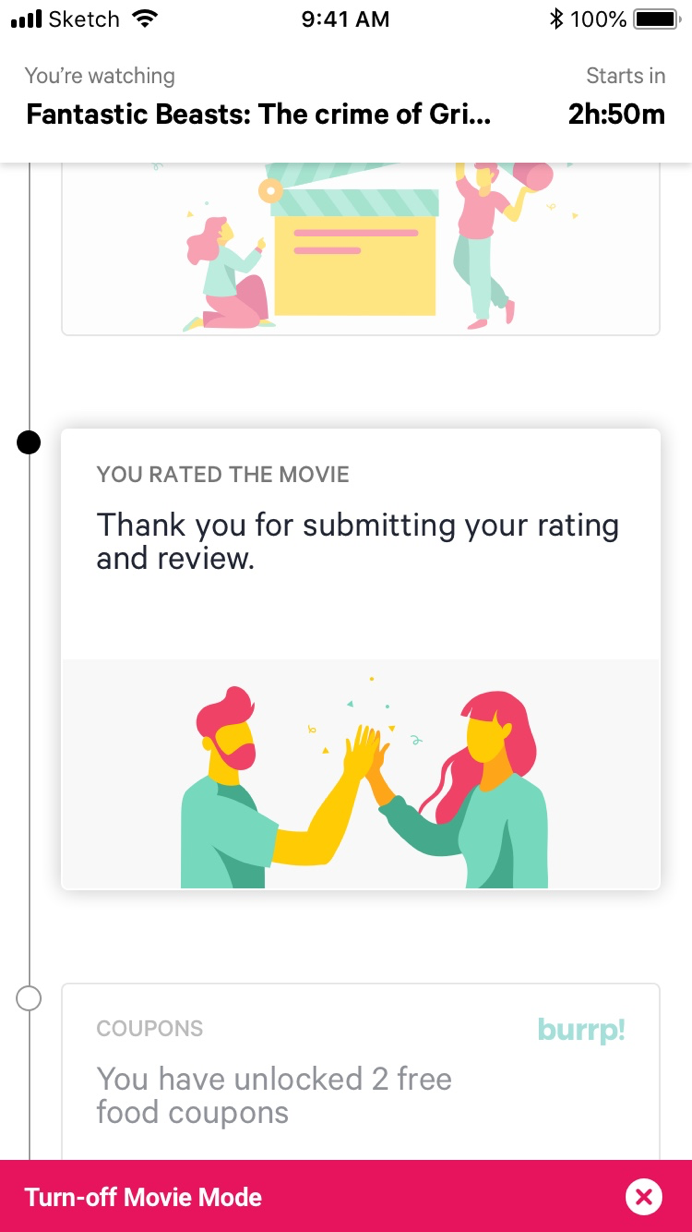
A small heart slider enabled users to rate the movie that they were watching. It helped BookMyShow's recommendation system to know user's taste, and recommend movies in the future accordingly. In addition, it kept the user engaged until the very end.
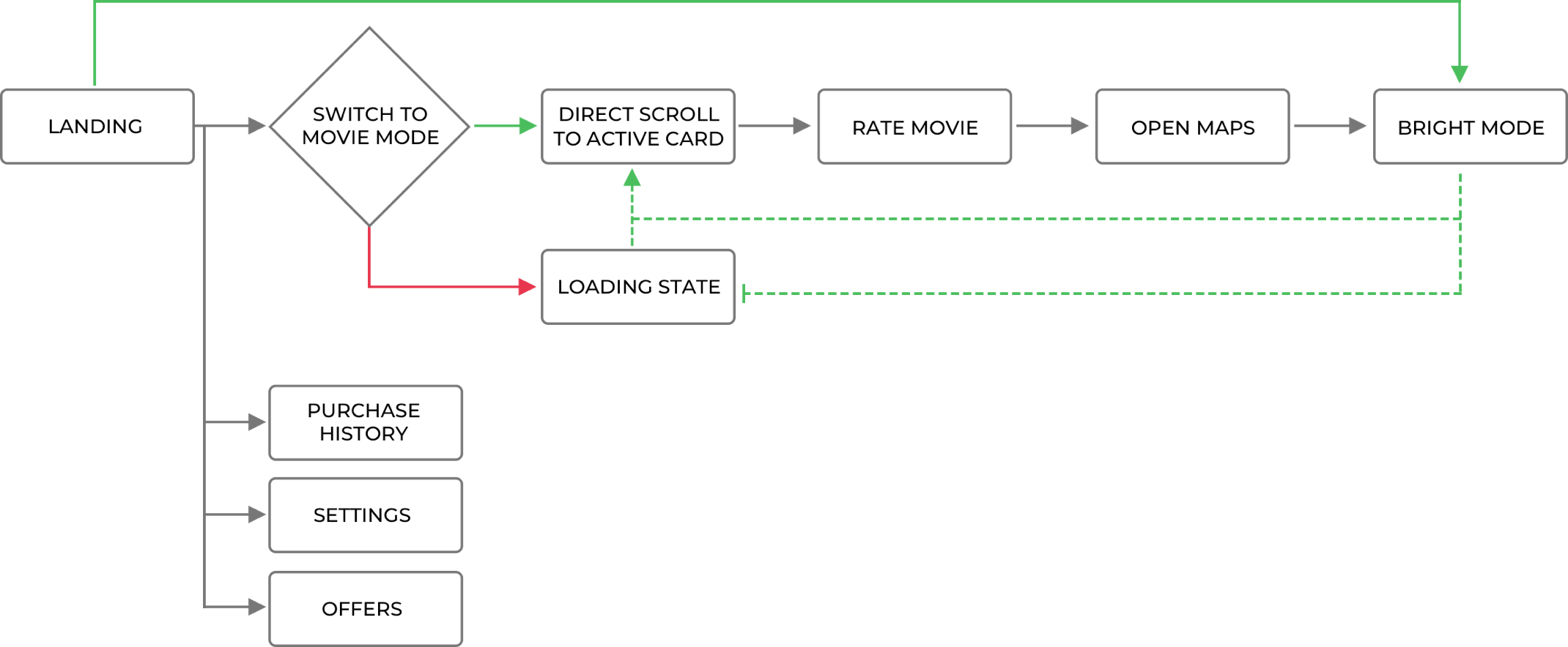
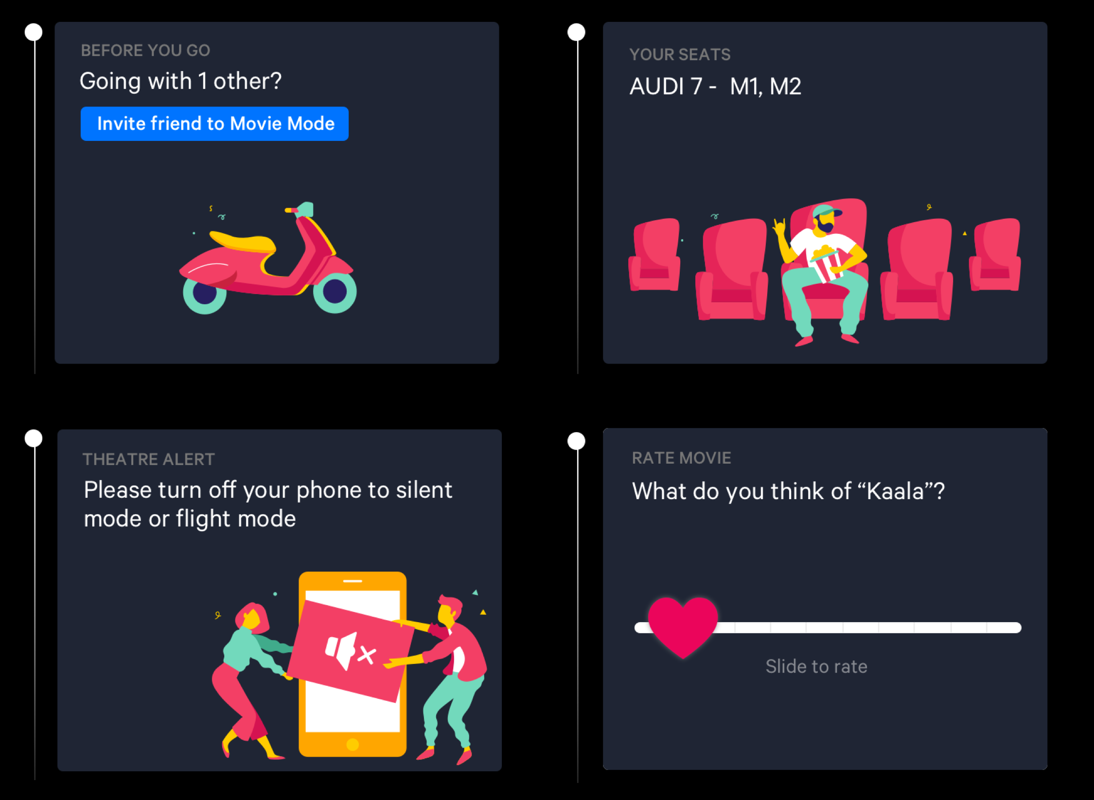
Before the movie starts, in X minutes, the movie-mode will automatically change to dark mode. As a team, we strongly believe in theatre etiquettes and don’t want to annoy other people in the auditorium with the bright screen. Everything experienced so far while scrolling through different cards can be seen in dark mode as well. The switch is given at the bottom of all cards. Here is a quick look at the dark mode.
The palette used for these illustrations are background agnostic. So be it white or dark, we have used the same image. This helped to keep the size smaller (in terms of KB) and also re-use the same illustrations in both backgrounds.
My team and I conducted 12 testing sessions within diverse demographics. We designed a testing protocol and below are some questions that we asked the participants to learn users' behavior and experiences. Furthermore, I was responsible for coding the notes and mapping down the patterns to get meaningful insights.
The post booking engagement on the BookMyShow Mobile App increased by 41% within the first three months since the release of this new feature. There was a strong buzz around the feature and the company on it's release. One of the cab operator approached the company on the release of this feature for partnership to add an option to let users book a cab to and fro from theaters.