Floaura
A virtual plant shopping and tailored plant care community driven experience for novice and enthusiast plant owners
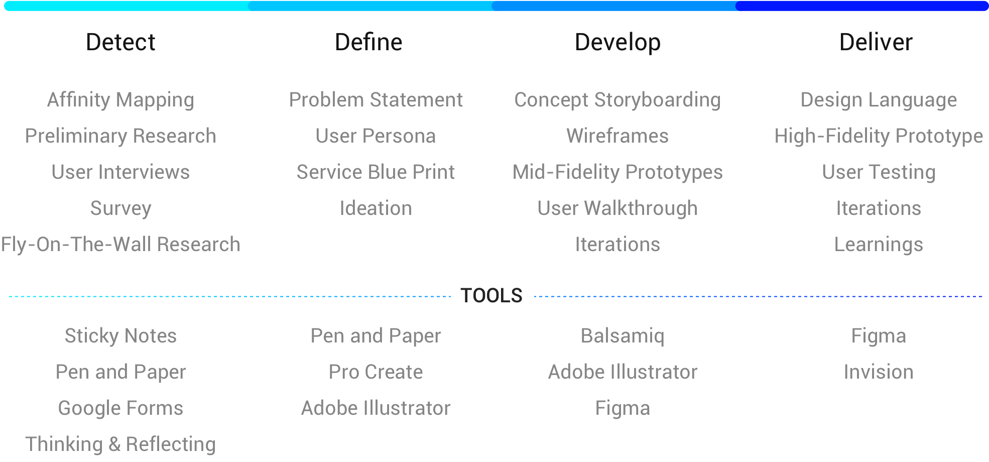
Role
- User Research
- User Experience
- Interface Design
- Prototyping
Duration
- 3-4 months
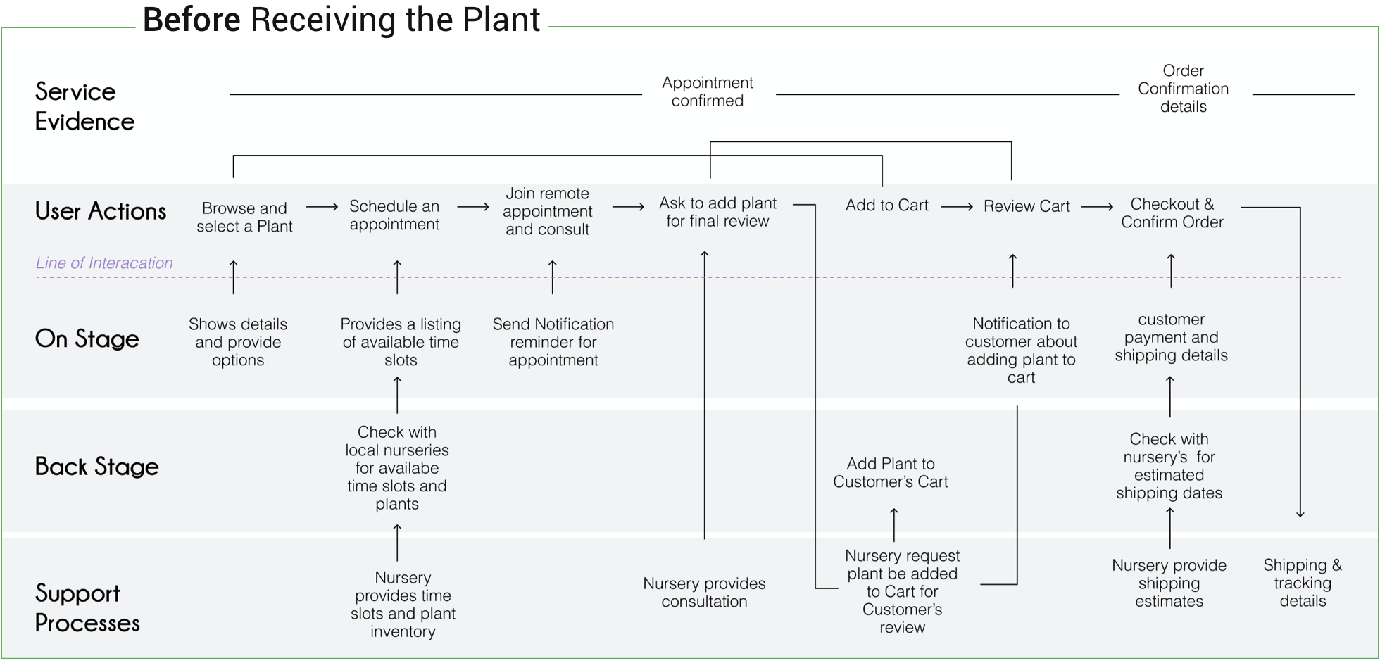
There is a perception battle of buying plants online that it would not be as per the reality and satisfactory. To an extend, it is true! Beyond the complex systems involved in getting live plants delivered at home, I also emphasized and experimented with the human experiences of this process - how they actually impact people’s lives before and after receiving the plant
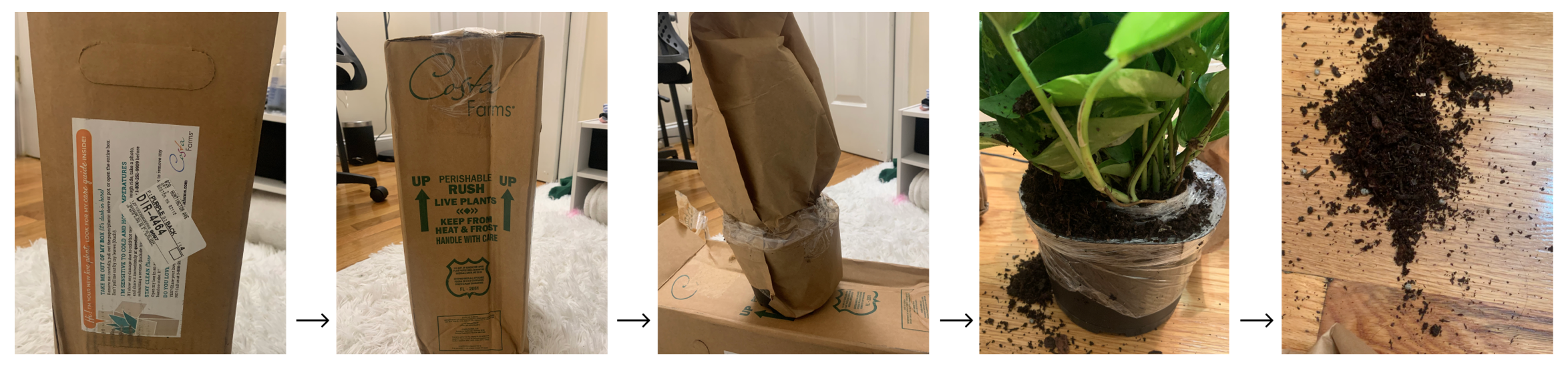
Before buying a plant, there is a lack of transparency - What you see isn't always what you get especially with fresh produce of which plants are a member. For instance, size or shape might not be as expected or on delivery, plant might be dead, unhealthy or rotted. After buying the plant, there's a lack of accurate access toknowledge about plant care and discerning right information from wrong about plants and it's care.
I focused designing the experience on:
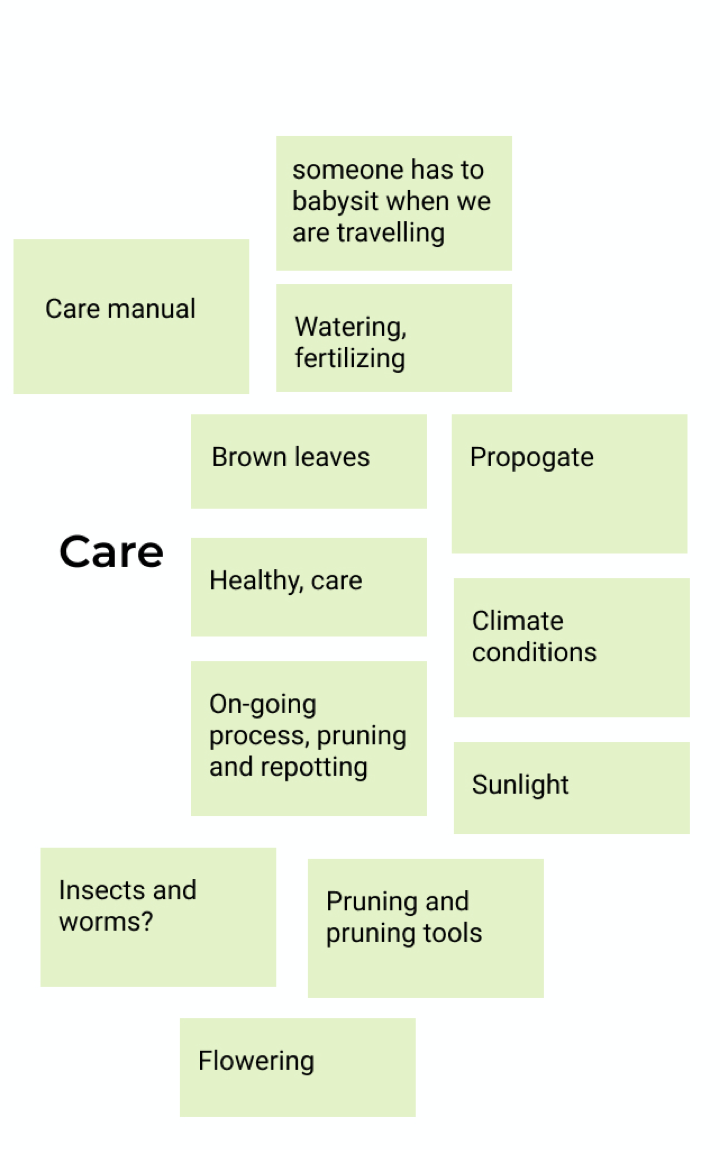
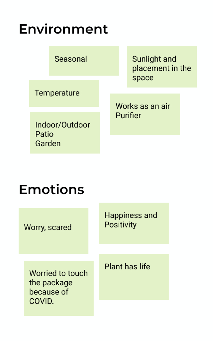
I started with organizing ideas and collaborating with my peers to brainstorm different parts of plant delivery and it’s care before I deep-dived into interviewing relevant users to set things in motion.

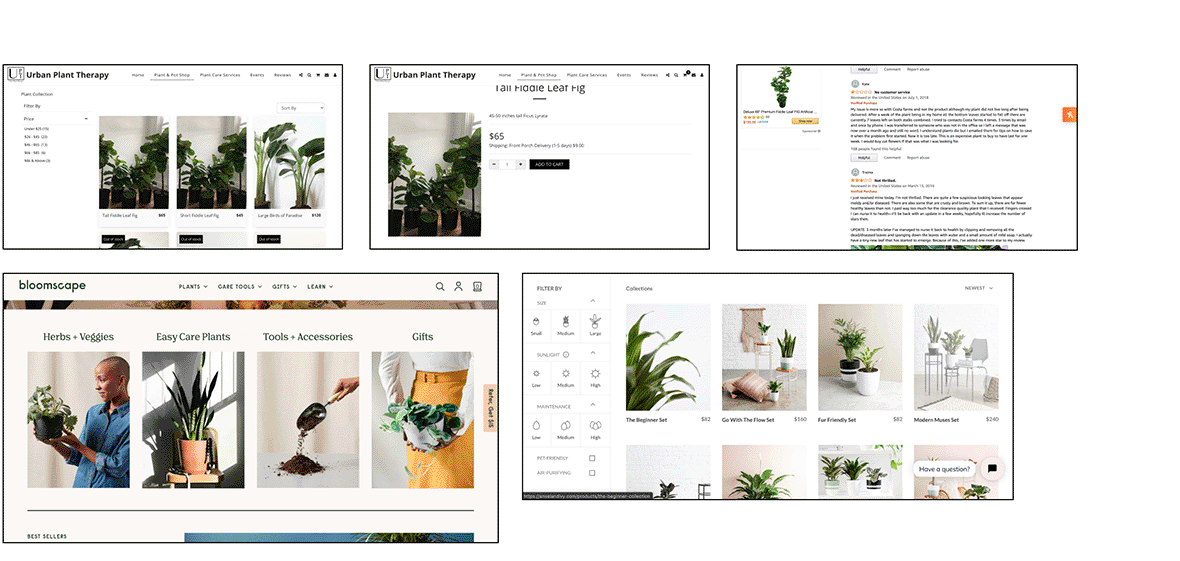
I browsed through existing platforms and mapped down their limitations. This helped me narrow down my next steps.
Dominant insights from the survey displayed worries of misleading photos and in-transit damage. Users struggled to find catered advice for their plants.
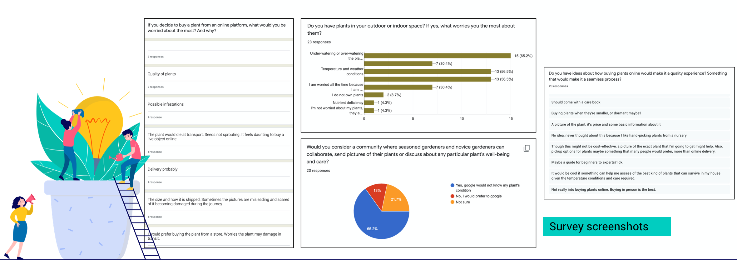
“It would be cool if something can help me assess of the best kind of plants that can survive in my house given the temperature conditions and care required.”
“Having the pictures of the actual plant which will be shipped while ordering will be helpful.”
A coding scheme was then developed for analyzing the patterns from the data received. Transcripts were largely analyzed by the unit of responses to each question, but particularly long responses were broken into paragraphs and analyzed to get meaningful insights.


Floaura
Plants + it's joyful and positive aura
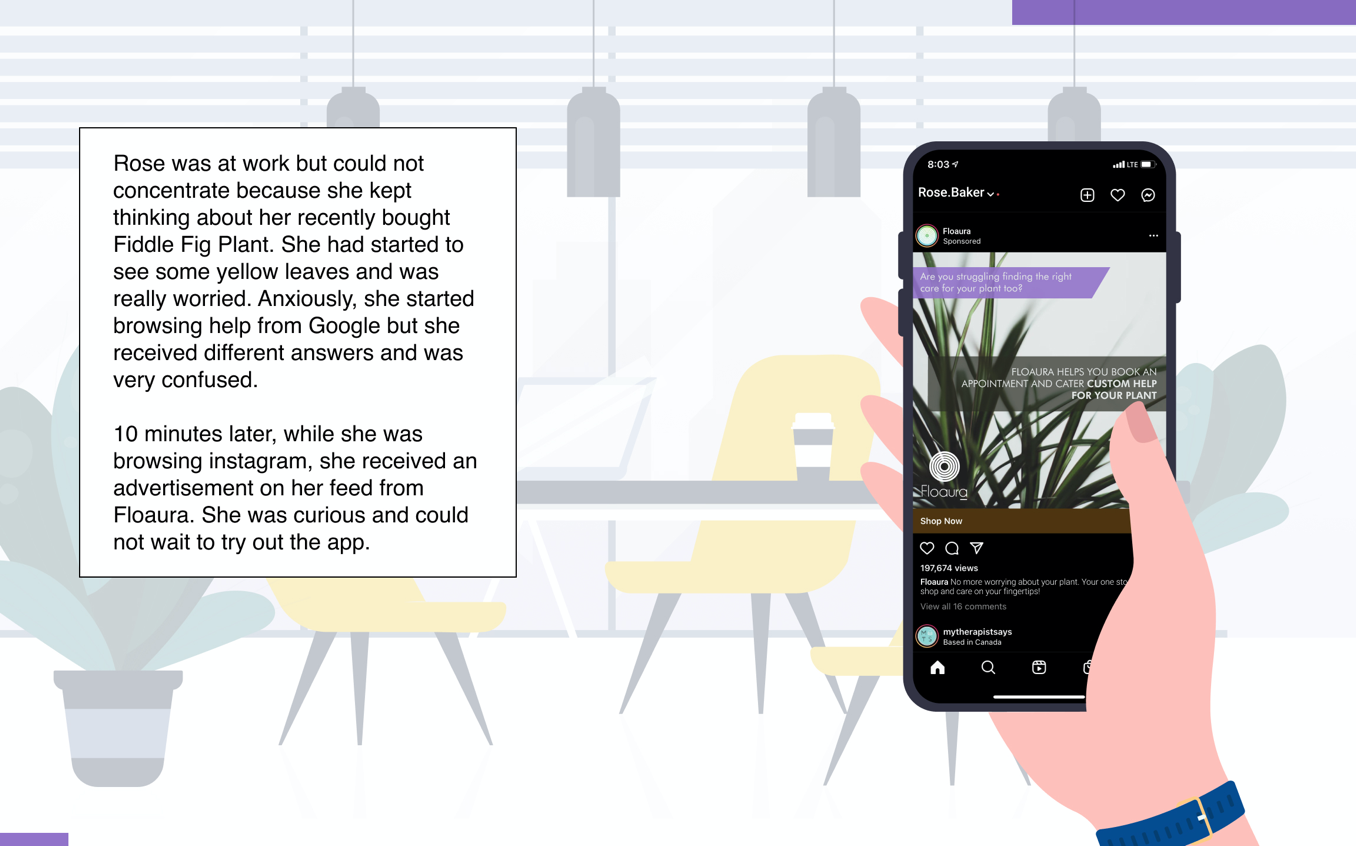
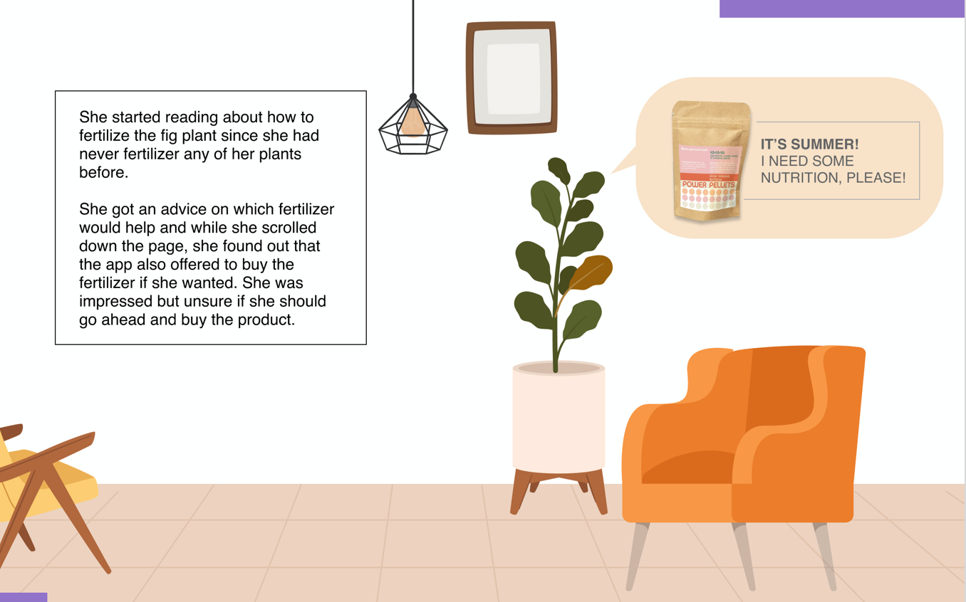
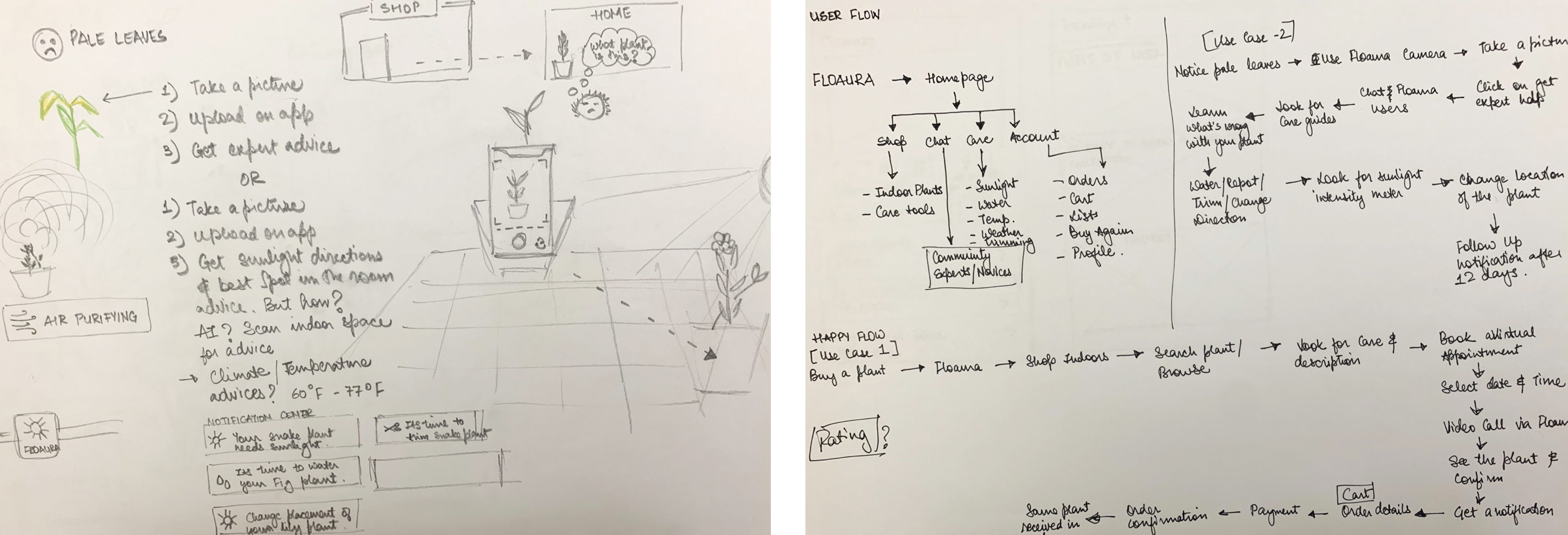
While doodling concepts I asked myself how Rose Baker (Persona 1) would enjoy the aura of being around plants and what could disturb the aura if she notices pale and yellow leaves.
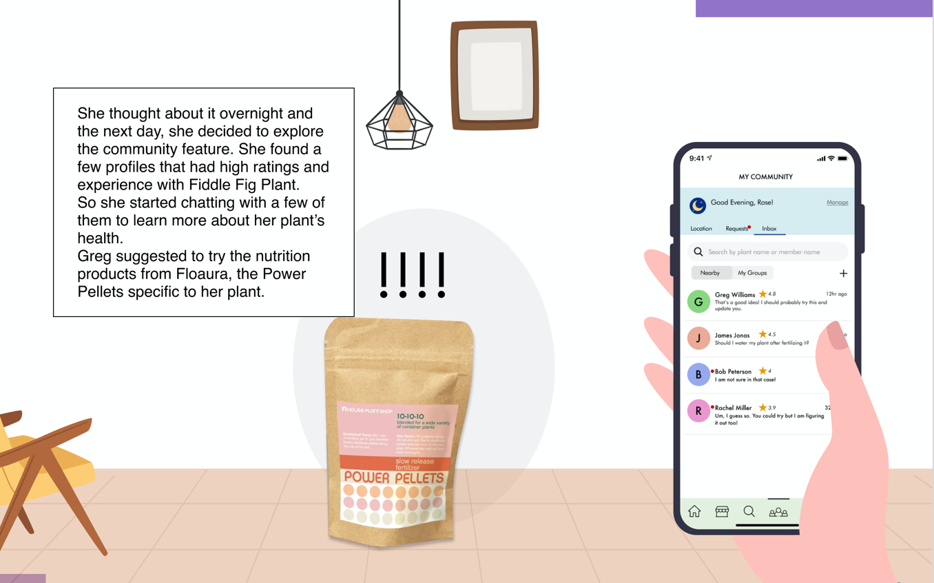
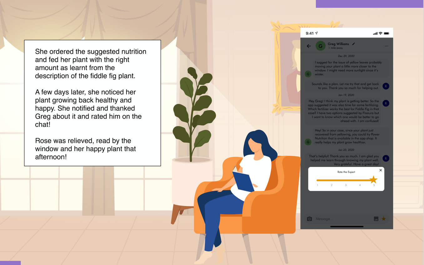
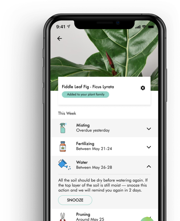
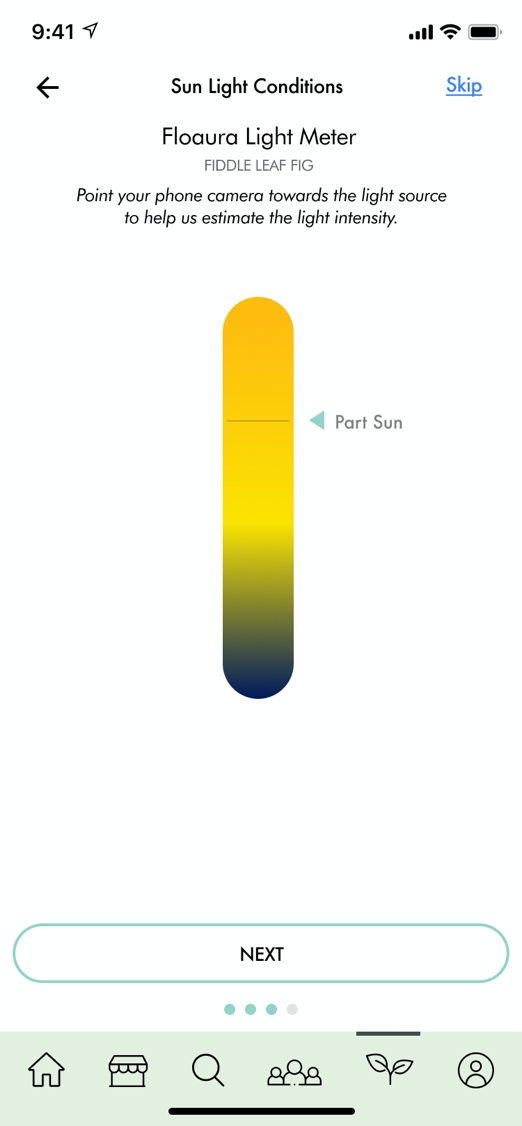
The idea is to keep users engaged through before and after receiving of the plants. Firstly, tying up with the local nurseries, would reduce the changes of receiving unhealthy plants since they would arrive within a day or two. This will result in less returns/exchanges of plants and support local businesses . Secondly, I would also like users to come back to the platform and so it is important to stimulate them into engaging in a community-based feature by helping them with the need of learning to take care of plants and become better gardners.


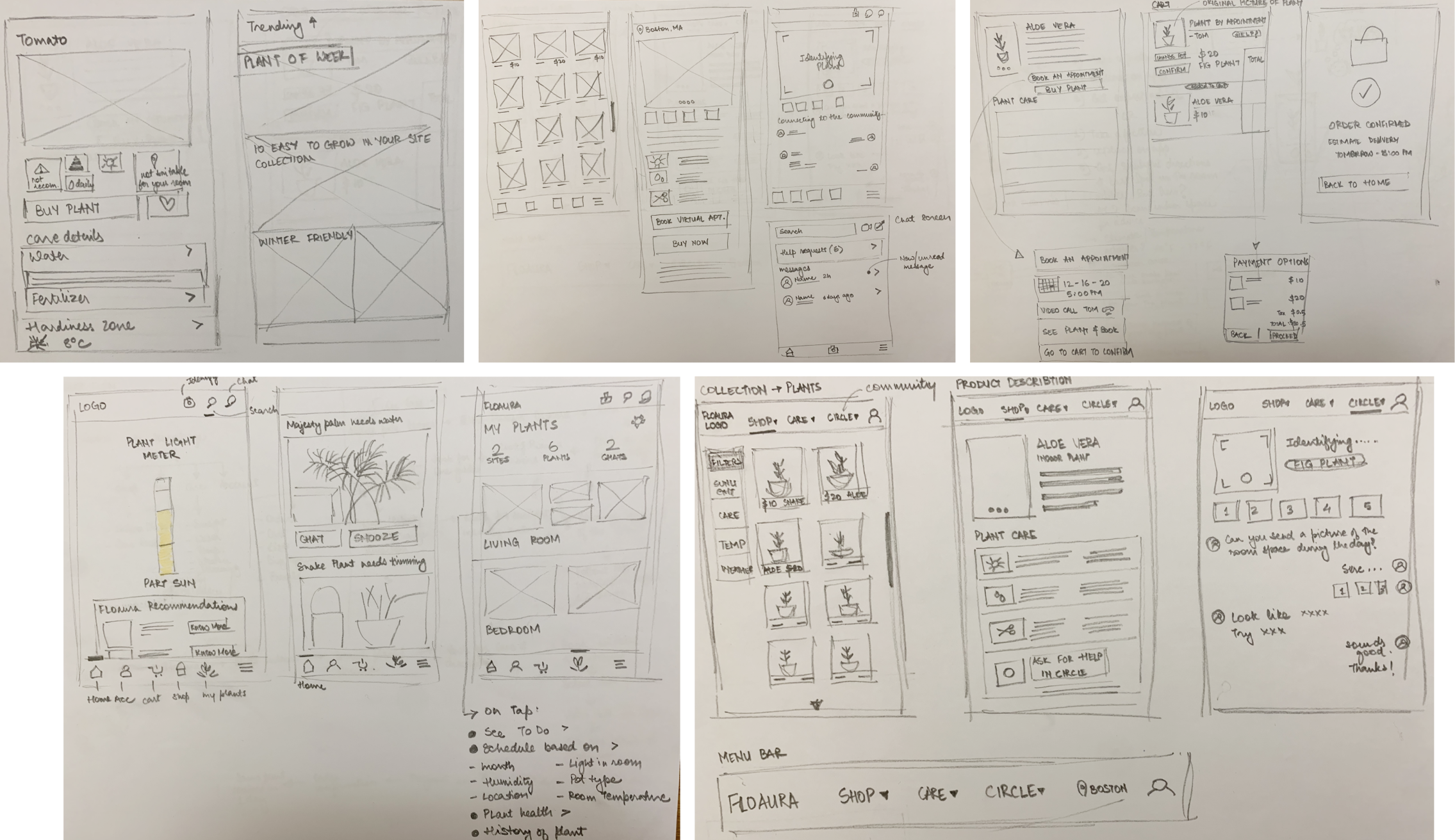

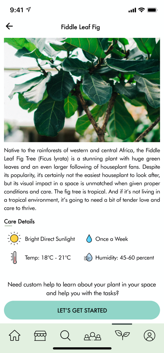
The live indoor plants and its aura pointed towards fresh colors with ligible and crisp typeface selection. The look and style of the visuals and the interface designs must not only be attractive to potential users, but must also be functional and created with users in mind. It is also crucial to keep the consistency of the button placements, because when users travel from one screen to the other, the seamless and easy navigation would eliminate dropouts midway.


To identify pain-points users encounter, a usability testing protocol was generated. I interviewed 3 participants including both novice and expert plant enthusiasts. The goal was to allow the user to interact with the app, while navigating through the tasks.
High-level insights:

One of the many things I learnt while prototyping was, when users use one hand to interact with their mobile app, it is very crucial to understand and implement most of the navigations and critical clicks in the bottom area. This allows people to access the interface without difficulty, and also enhance the overall usability and reachability of the mobile app.
Before the survey and interviews, I anticipated to design the experience of receiving the plants but the survey insights inspired me to tackle the core issue of the care of plants. The past few months have been swift, challenging and fun. Regardless, I’m proud of everything we’ve learned so far and look forward to endless improvements.